Chart

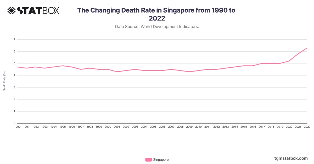
The Changing Death Rate in Australia from 1990 to 2022

The Changing Death Rate in Australia from 1990 to 2022

Share the statistic on social media channels or embed the statistic in your website using "Embed Code", where available.

Share chart

Embed chart
Select Citation

Cite this statistic and select one of the following formats: APA, Chicago, Harvard, MLA & Bluebook


  • APA
  • Chicago
  • Harvard
  • MLA
  • Bluebook
  • IEEE
TGM StatBox. (2024). The Changing Death Rate in Australia from 1990 to 2022. TGM StatBox.
Insights

Key Takeaways

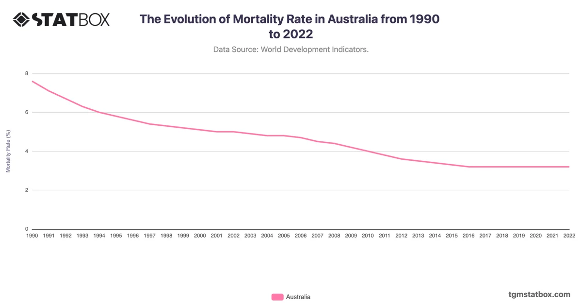
Australia’s death rate generally declined from 7.0 in 1990 to a low of 6.3 in 2018, reflecting improved healthcare, higher life expectancy, and a younger population. However, post-2018, the rate showed periodic increases, peaking at 7.3 in 2022. The jump in 2021 and 2022 can be attributed to pandemic-related fatalities and an aging demographic, signaling an emerging shift in Australia's population health trends.

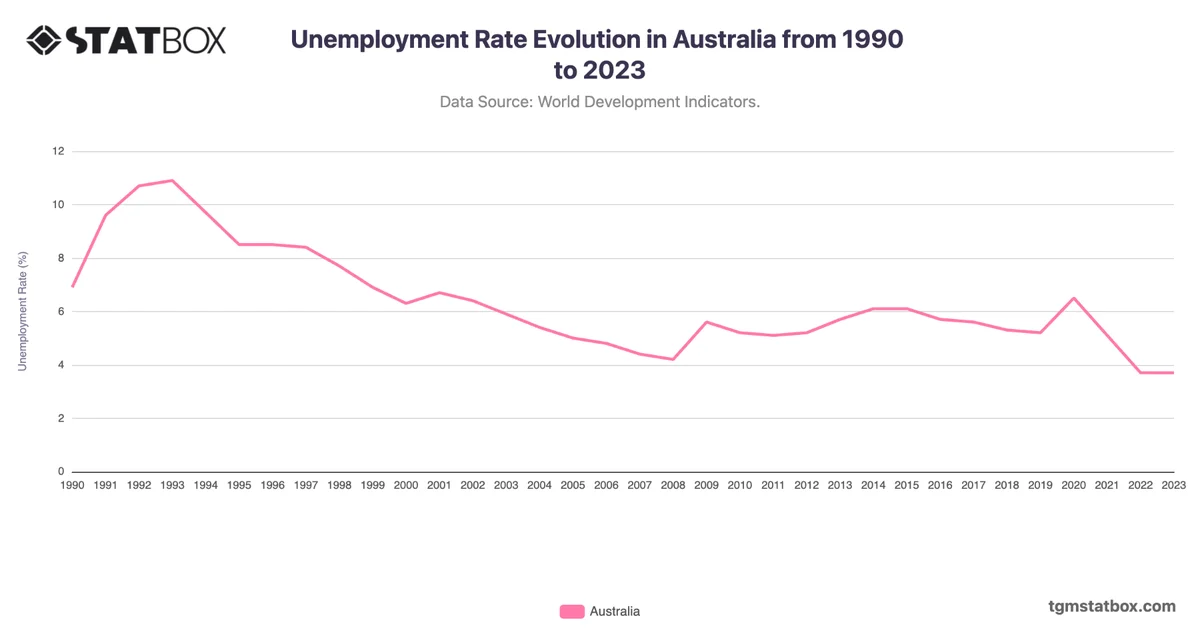
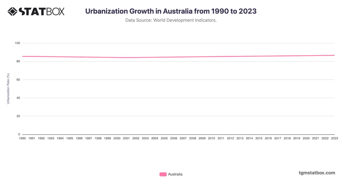
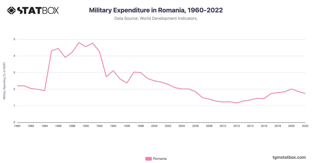
Explore related charts to gain a better understanding of Australia’s urban population growth, Australia’s unemployment rate evolution, Australia’s military spending.

AI-powered chart insight: This summary is automatically generated to help you understand the chart at a glance. It is intended as an overview; view the full chart and underlying data for complete context.

Related report

Would You Like to Know More?
Explore Our Australia Report

Charts library

Further Recommended Australia Statistics

Statbox vector
The briefing
New data, in your inbox

Consumer insights, data stories and product updates as we publish them. No other mail, and one click to leave.

Roughly two emails a month.

Research services
Have a question our newsroom hasn't answered? Ask it directly.

Our team can run the study behind the story — in 60+ countries, on your question, with the data belonging to you.